Justine Pile

![]()
Database analyst, software engineer, and data scientist with Bachelor of Information Technology (IT) and a recent graduate of UC Irvine's Data Analyst Bootcamp, 5+ years working in IT, and 7+ years working in healthcare. 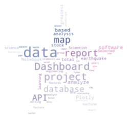
Selected projects in data science, machine learning and software engineering
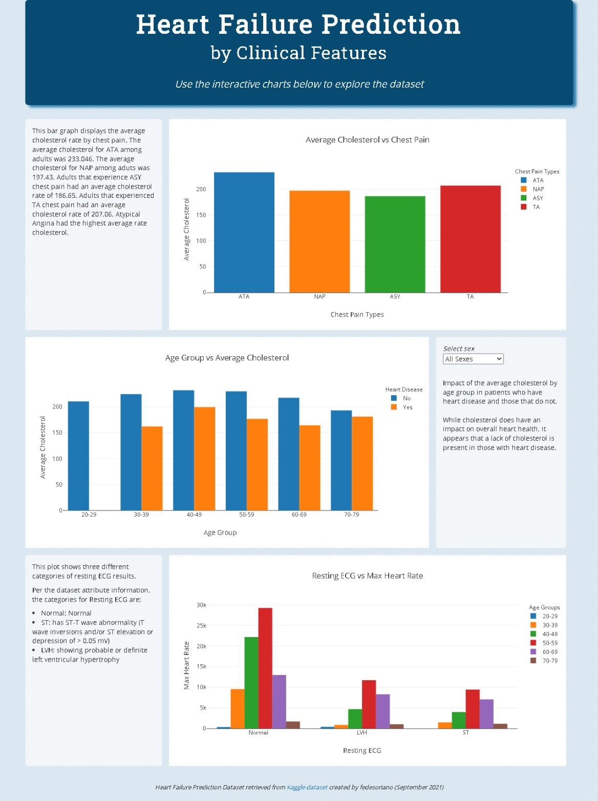
Heart failure prediction based on clinical features
As a group, we created a Plotly dashboard in JavaScript to analyze clinical features of heart failure to better understand their relationship with each other. My principal contributions were most of the HTML and CSS (forked from Bootstrap), along with the third plot.
![]()
![]()
![]()
![]()
![]()
![]()
Please give the dashboard website a moment or two to load as the Flask API it uses is hosted on a free (slow) Render service
View Dashboard
View Code on Github
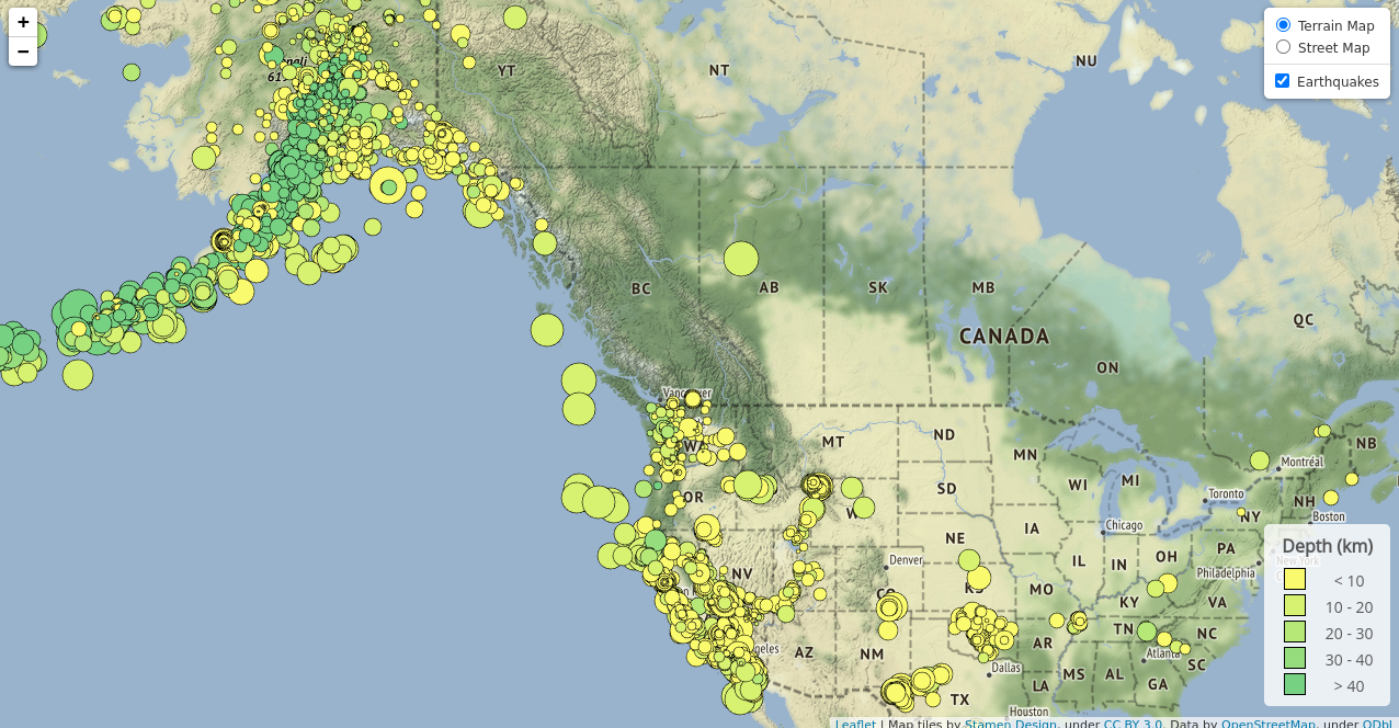
Leaflet map of earthquakes
This Leaflet map displays USGS earthquake data for the last 30 days, with marker size based on magnitude and color scale based on depth of earthquake.

![]()
![]()
![]()

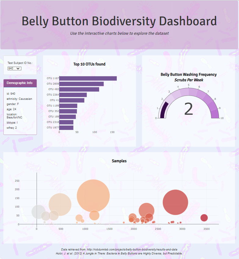
Plotly Dashboard that explores the ‘Belly Button Biodiversity’ dataset
This Plotly Dashboard was created using JavaScript with HTML and CSS and it explores the ‘Belly Button Biodiversity’ dataset which catalogs the microbes that colonize human navels.
![]()
![]()
![]()
![]()
View Dashboard
View Code on Github
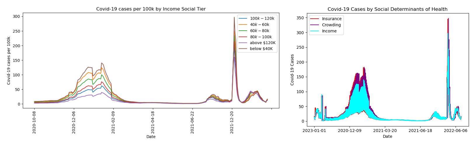
An analysis of the impact of social determinants of health on COVID-19 case rates in California
Group project where we used Python dataframes and Matplotlib visualizations to analyze the impact of three social determinants of health (insurance, crowding, and income) on COVID-19 cases. For this project, I performed initial data manipulation and created the visualizations.
![]()
![]()
![]()
View report PDF
View code on GitHub
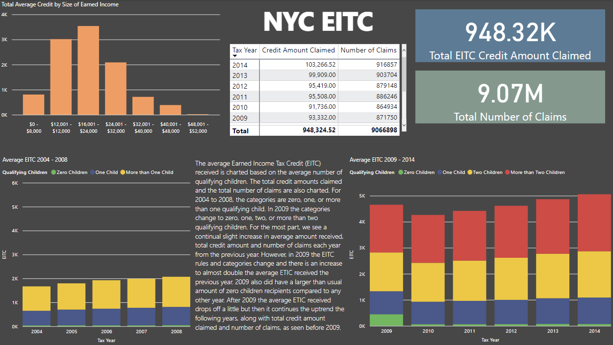
PowerBI report of NYC EITC and Manhattan home sales
A brief report of NYC EITC total claims, total credit amount claimed, and average credit recieved, along with a brief report of Manhattan home sales by neighborhood.
View report PDF
View code on GitHub
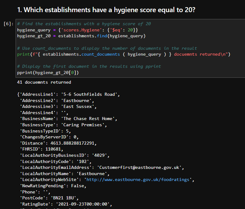
Evaluating various establishments across the United Kingdom using PyMongo
The scenario for this project was to evaluate some ratings data in order to help journalists and food critics decide where to focus future articles. Uses a JSON file to create a MongoDB database and then PyMongo in a Jupyter Notebook to anlayze the database.
![]()
![]()
![]()
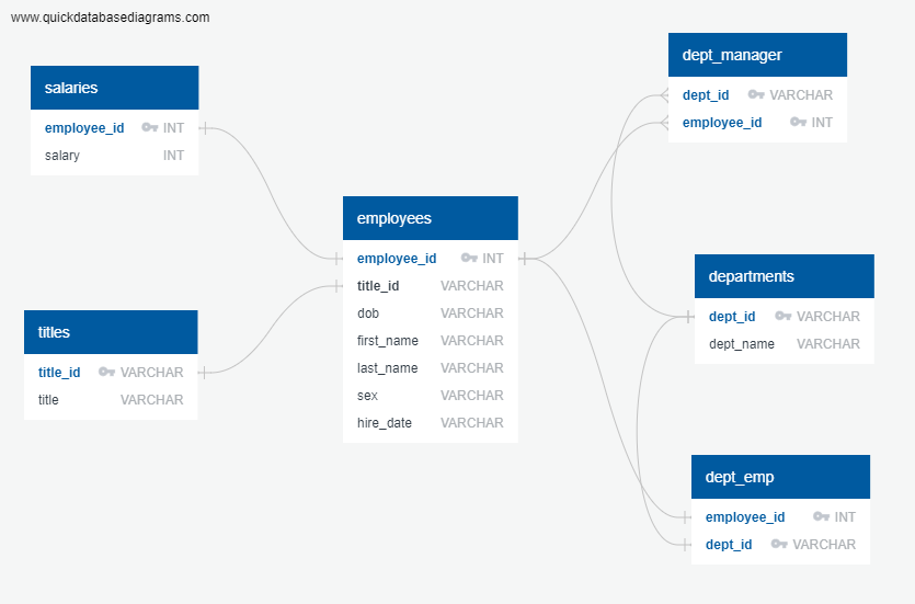
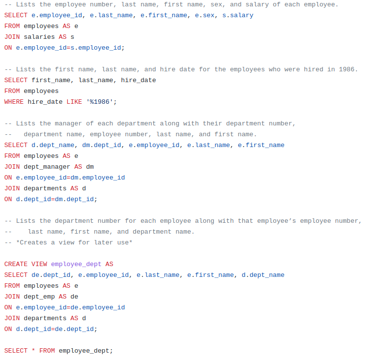
PostgreSQL project to research about people whom a company employed during the 1980s and 1990s
Created an ERD to map out the database to be created, then created a schema SQL file, and finally created a queries SQL file to do data analysis.
![]()
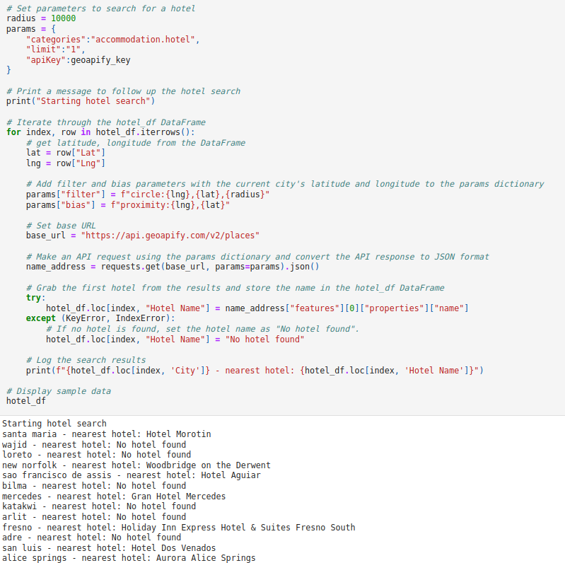
Using the OpenWeatherMap and Geoapify Python API’s
WeatherPy utilizes the OpenWeatherMap API to collect data for analysis of relationships between variables to ultimately allow the data to be filtered so as to only have cities with idealized weather conditions. Then, VacationPy, using the Geoapify API, finds the nearest hotel to each city and plots that on a map.
![]()
![]()
![]()
View WeatherPy Notebook
View VacationPy Notebook
View code on GitHub
Visual Basic for Applications macro script to analyze stock data in Microsoft Excel
VBA Excel script to loop through a spreadsheet of stock data and give various outputs including the yearly change in price for each stock as well as the percentage change, the greatest percent increase and the greatest percent decrease, and the greatest total volume.
![]()